CSS animation for dummies
May 02, 2020 - 9 min read
An animated element is worth a thousand words
Animation in CSS is one of those topics that, for the uninitiated, looks more complicated than it should. The first time I've seen animation code in CSS, the whole thing looked a bit odd and I couldn't make heads for tails for what I was seeing. Thanks to that (perceived) complexity, a lot of people simply ignore the power that animations have in CSS and end up messing with animation only when they have to.
This leads to the (ab)use of prebuilt animation frameworks, such as animate.css or react-animations, and the programmer trying to fight the framework instead of working with it. Don't get me wrong, these frameworks are not the problem -- in fact, they're amazing and I've used them a couple of times -- but trying to do complex animations without understanding the bare minimum of the essentials is what get people in trouble.
Motion attracs attention (Photo by yabayee)) Motion attracs attention](/static/b41173a7ea58b990451a9a3a19a0d950/ae694/bee.png)
So, the objective of this post is to introduce you to the minimum you need to know about how to make animations in CSS. The aim is not to detail every single option possible, but give you enough explanation and examples to handle 90% of your animation needs (unless you're doing something really weird with your website) and enough baggage to correctly use animation frameworks, as well as reason about animation samples in the wild.
With that disclaimer out of the way, let us start with the keyframes.
Keyframes
As you (hopefully) know, when you're watching a movie, the illusion of movement is created by quickly swapping still images (frames) so fast that your eye is tricked to think that movement is happening. The same logic applies to every kind of animation, but thankfully, we don't need to define every single frame of a CSS animation, but only the ones that matter: the keyframes.
A keyframe represents a specific style to be applied to an element in a given time moment (don't stress about time right now, we will talk about it soon). In a single keyframe, you define the values of one or more CSS properties of a given element and, by defining multiple keyframes with different values in the properties, the values changed are interpolated through time, creating the "missing" frames of the animation.
This might sound complicated, but it isn't. For example, imagine that we want to create an animation to make an element grow from width: 50px to width: 150px. To do that, we will need to create two keyframes: one with the 50px value on the width and the other with the 150px. Once these specific points are defined, the "intermediate" frames (the slow of fast growth from 50px to 150px) would be automatically created for us.
So, how do we define these keyframes then? This is done by the @keyframes CSS rule. In a @keyframes, we can specify a name for our animation and then each keyframe, either using a from and to as names (useful in only simpler animations) or by using a percentage value indicating the moment where the property change in the animation. To create the example of the previous paragraph, we could create an animation called grow (not a special name, it can be anything) with the following code:
@keyframes grow {
  0% {
    width: 50px;
  }

  100% {
    width: 150px;
  }
}
This code means that at the start of our animation (the 0%) the width of the element should be 50px and, at the end (100%) it should be 150px. This is simple enough to understand, but there are two pressing questions to answer before we could see our animation working: on which element it will be applied and for how long it will last.
Luckily for us, both of these questions can be answered by the animate CSS property, that in its simplest form needs at least two elements: the animation name (grow, as we defined above) and the duration. To see the animation coming to life, create a div with a class square, and use the following CSS code:
.square {
  background: red;
  width: 50px;
  height: 50px;

  animation: grow 2s;
}

@keyframes grow {
  0% {
    width: 50px;
  }

  100% {
    width: 150px;
  }
}
Notice how we first defined some general properties to make our div visible and then specified that the element should use our grow animation, and the duration should be two seconds long. If you're not feeling the urge to type this little snippet, check out this pen and see it for yourself. The result should be like this:

Whoa! It worked! While this is indeed a nice start, an astute observer will certainly raise some questions about the behavior of our animation:
- The animation plays only one time. What if I want a repeating animation?
- After the end of the animation, the square "magically" shrinks to the initial width. Shouldn't it stop at the last animation state?
Let us delve a little deeper into the animation properties and see how we can handle these situations.
The finer details
Remember when I said that, in its simplest form, the animation property required only the animation name and its duration? Well, it turns out that the full format of the animation property is:
/* the shorthand animation property */
animation: [name] [duration] [timing-function] [delay] [iteration-count] [direction] [fill-mode] [play-state]

/*
You can also specify the details as individual values.
Here I will show the default values, when not specified.
*/
animation-name: none;
animation-duration: 0;
animation-timing-function: ease;
animation-delay: 0;
animation-iteration-count: 1;
animation-direction: normal;
animation-fill-mode: none;
animation-play-state: running;
Just looking to the name of the properties is enough to know what half of the mean. We already know name and duration, and delay, iteration-count, direction, and play-state have pretty obvious names. As you probably guessed by now, our first animation plays only one time and stops the default value for iteration-count is 1 and we can change this to a specific number to make the animation repeat "X" times or the special value infinite, to keep the animation playing to eternity.
The animation-direction has a couple of interesting values. The normal value is, as expected, an animation that plays forward (e. g. from the first to the last frame) and reverse, as the name suggests, plays the animation backwards (from the last to the first frame). We also have the option of alternate, that plays the animation forwards, and the backwards and alternate-reverse, that plays backwards and then forwards.
By using iteration-count and direction together, we can make our square grow and shrink indefinitely (demo here):

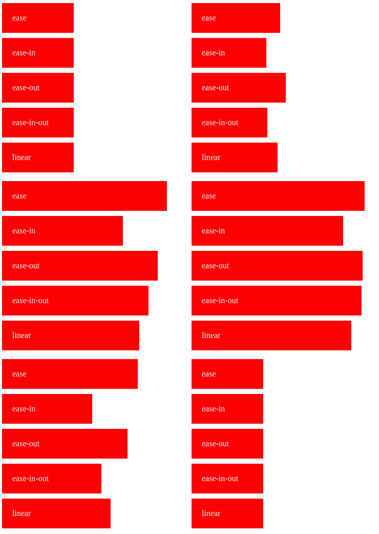
This covers the case for repeating animations quite nice but depending on your case, you might want to customize the timing-function. This property determines how slow or fast the animation goes, and the default value, ease creates an animation with a slow start, a faster middle, and a slow end. The other options are ease-in (slow start), ease-out (slow end), ease-in-out (slow start and end), and linear (constant speed from start to end).
To better understand the differences in timing-function, let us compare how the animation changes depending on the value of the timing function (demo here):

Such a small change can have a huge effect on how our animation is perceived (the user can perceive it as faster or slower than it is), so make sure to always check if your timing-function is doing the job the way you want.
The fill-mode property
With the scenario of the infinite animation done, it is time to tackle the second question and answer why, on our first animation, the values of the animated properties were "reset", instead of keeping the values of the last frame. Well, this happens because of the fill-mode property, that in its default value, none, specifies that no style changes are applied either before or after the animation.
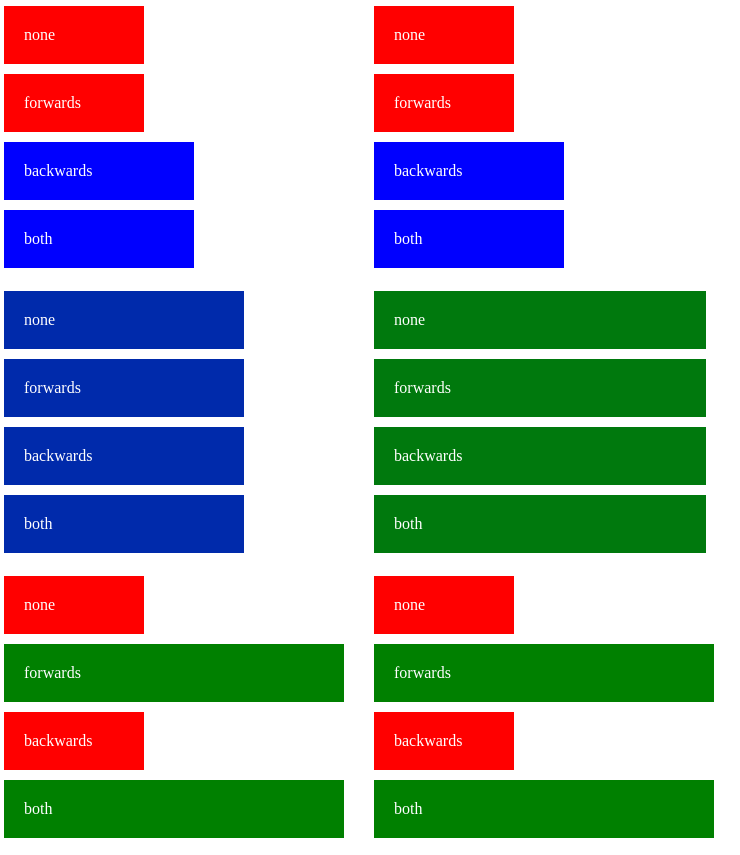
The other possible values of this property are forwards (the style of the last frame is retained), backwards (the style of the first frame is used at the start, including the delay period, if any) or both (a combination of the previous options). An important thing to take notice when setting this property is that the frames used as reference (especially in forwards and backwards) take into account the direction property too, so make sure you sort out the animation direction first, to avoid nasty surprises later.
To better see how the fill-mode affects the animation, we will change a few things in the last sample. First, our base square class will set its width to 100px and background color to red. The first frame of the animation will have a width of 150px with a blue background, while the last one will have 300px in width, with a green background.
Enough talk, let's see this property in action (demo here):

Notice how the color change helps us visualize better when the style of the frames is applied. Take note of how both and backwards already start on the first frame during the delay period but only both and forwards retain the style of the last frame. A keen eye will also note how none and forwards keep the original style intact during the delay period, applying the style of the first frame right after that. the ability to understand these little changes in behavior can seriously impact how your animations are perceived by the users.
The next steps
And this is the bare minimum you need to know about CSS animations. As said earlier, we didn't touch on the more arcane topics of CSS animation, but we did see enough to not be afraid to mess around with it. With the current knowledge, you can mix and match simple properties (sizes, positions, opacity, and even transform) to do most of the common scenarios that you need. Be creative and experiment!
On the other hand, if you're not a big fan of doing everything manually, you now have enough knowledge to understand the "behind the scenes" of how the CSS animation libraries works, allowing you to better understand and customize the available options for your needs.
Last, but not least, both Animate.css and Animista help you quickly test a preset of animations and check the generated code. Play around with the existing animations and check the source to see that most of the time, the basics that we've seen here are enough (well... with a healthy dose of creativity, of course) to create truly amazing effects.
Code Overload

Personal blog ofRafael Ibraim.
Rafael Ibraim works as a developer since the early 2000's (before it was cool). He is passionate about creating clean, simple and maintainable code.
He lives a developer's life.